Planet Cruise – Checkout portal
UI Design, Interaction Design, Branding, UX Research, Competitive AnalysisI was assigned to the Online Booking System flow. I contributed in giving design insights for the Online Booking System. I redesigned components, and presented innovative user-centred designs to the Product & Design team.
Despite my contribution and design of different kind of experiments, I also worked giving design & methodology, and code integration insights.
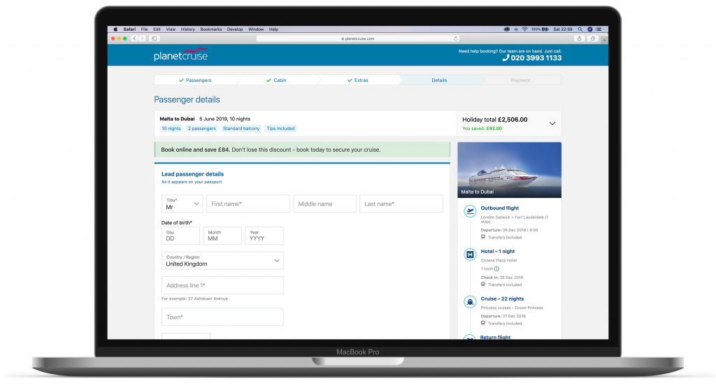
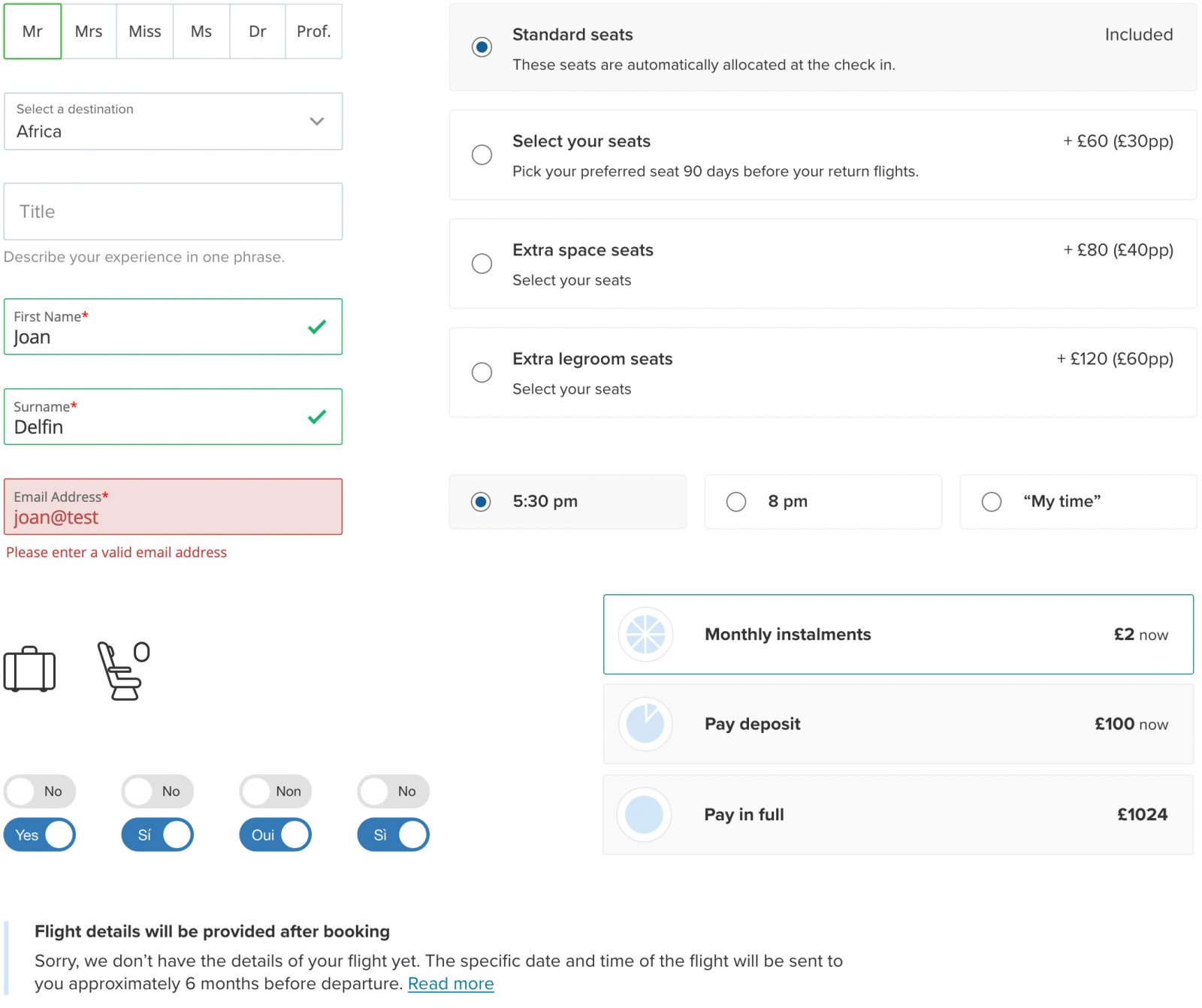
The “Before”
I believe the key for increasing the conversion rate is improving user feel, look, and usability. Until I started working at Iglu, a consistent design had never been a priority.
Enriching the booking process
The purchase process is the culmination of a good e-commerce experience. How do we help to improve this experience? Starting from the premise that the whole process should be very intuitive and frictionless in order to facilitate and stimulate conversion, we had to implement browsing logic and visual processing solutions in such a way that the purchase process was improved.

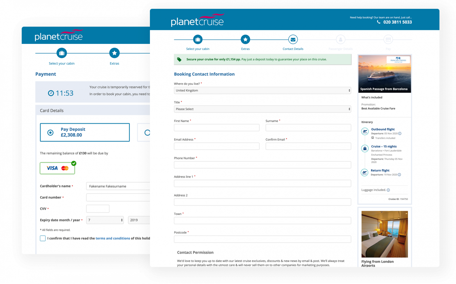
Creating a consistent UI across the Checkout Portal.
When I joined the team, my main priority was to work on a consistent UI accross the checkout portal flow. We gathered all the different colours and UI patterns, and started creating a pattern library and strict rules of use.
Developing a cohesive design system
No style guide existed when I came onboard. Part of the user experience and usability issues were due to an inconsistent design. Together with the Product and Design team started a pattern library which would set branding colours, UI patterns, and rules of use in different situation across the portal and the site.
Pain points and solutions
We A/B tested our designs in post launch, here are some successful tests of the tests that I designed, and successfully increased usability and conversion rate.
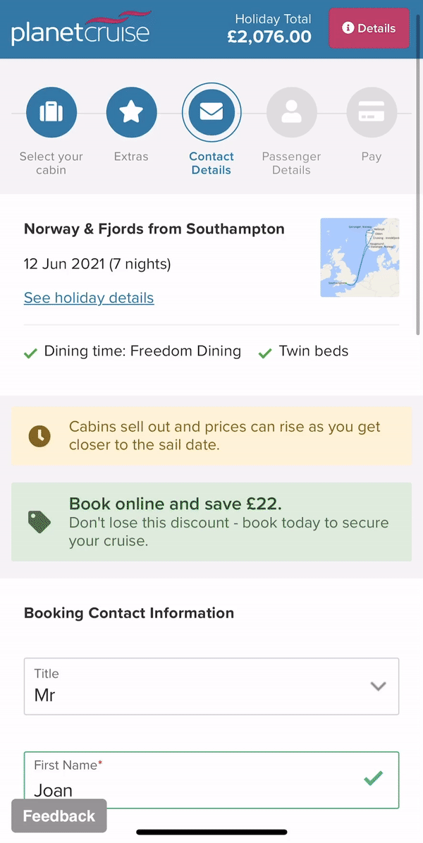
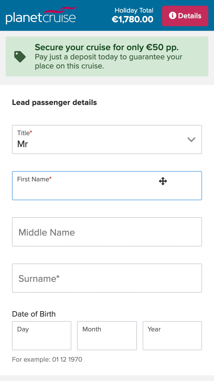
Forms & fields design
Reducing an average of 7 seconds to fill Contact details form. Previously 33 seconds to complete, 24 seconds to fill the new form, proving a considerable usability improvement.
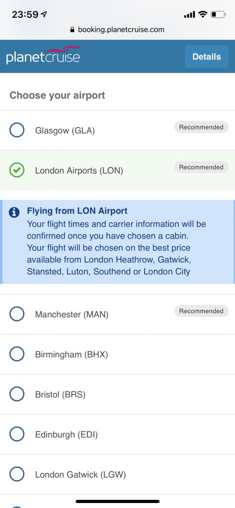
Airport selection
Users could only know if their selected airport was available once they press continue, many of them abandoned the booking process.
Due to Cruise line’s API traffic constraints, we could not retrieve all data in one go, so I designed this solution, where the user selects an airport, and checks its availability.
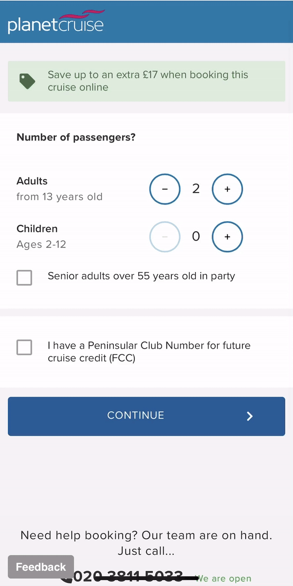
Passenger selection
The redesign was required in order to categorise ages, and, offer discounts depending on the passengers selection.
Initially the system displayed radio buttons to select the number of passengers. I just designed interactive and easy to use controls for age selection.
The itinerary details menu
Previously, during booking process the users were able to only check limited holiday package information. Because of that, our customers abandoned the booking process, and check more details on the itinerary details page.
To help users find all the information they need, I designed a full screen tabbed menu. The perfect solution to display all the information; organised, clean, and easy to navigate.